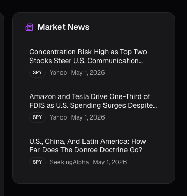
Dashboard News: A Filtered Stream Across Your Holdings
Generic news feeds drown you in noise. The Dashboard News card filters by your holdings and ranks by sentiment impact: what's new, what matters, why.
 Marcus Chen7 min read
On a typical weekday, the major financial news aggregators collectively publish somewhere between 40,000 and 60,000 headlines. A thorough reader who opens Bloomberg, Reuters, the WSJ, the FT, and the various sector wires could spend three hours reading them all and still miss the five or six that actually matter for their portfolio. The problem isn't scarcity of coverage. It's that the ratio of signal to noise is roughly 1 in 1,000 for any given reader, and the noise is professionally written to look like signal.
A useful news feed for a working investor is the opposite of a comprehensive one. It is filtered by your holdings, deduplicated across sources, and ranked by how much it should actually shift your view. This post is about what that filtered feed should surface, how to read it in five minutes a day, and which kinds of stories deserve immediate attention vs. which are commentary disguised as news.
TL;DR
- You don't have a news-reading problem. You have a news-filtering problem. The volume is the problem, not the depth.
- Three filters do 90% of the work: your specific holdings, cross-source novelty, and sentiment delta vs. recent baseline.
- "Mover" tagged stories are the rare actionable news. A high-novelty story on a name where the price hasn't yet moved is the thin slice of the feed worth real attention.
- Morning scan, intraday alerts, weekly review. Three touch points, each with a different goal.
- Skip commentary, not news. Commentary pieces rarely shift positioning; real news often does.
The problem with general financial news feeds
Bloomberg, Reuters, and every public aggregator produce thousands of stories a day. The overwhelming majority don't affect anything you own. Reading even a filtered version takes an hour you don't have, and most stories repeat the same headline with different angles. What actually matters is a much smaller set: stories that are (1) about your specific holdings, (2) material (not noise), and (3) novel enough to shift your existing view. That is a fraction of a percent of the raw tape.
The general feed also has a survivorship bias: the stories that get the most prominent placement are the ones that are most *interesting to read*, not the ones most *informative to hold decisions*. Those are correlated but not identical. A boring 8-K about a CFO change at a boring mid-cap you own is often more information-dense than the front-page analysis of what the Fed said at Jackson Hole.
What the News card shows
The Dashboard News card aggregates stories across your portfolio and watchlist with three things happening under the hood:
- Deduplication across near-identical versions. One story about NVDA's earnings might hit the feed from Reuters, Bloomberg, CNBC, and three wire services within minutes. The card collapses those into one row with links to all sources.
- Material-impact scoring. Each headline gets a score computed from (a) model-estimated sentiment delta vs. the prior week's baseline for the named ticker, (b) cross-source novelty, whether the story is appearing across multiple publications in a short window, and (c) time-since-publication decay.
- Mover flag. Price action since publication is a signal that the market agrees the story is material. Stories with a post-publication move of more than 1.5 standard deviations on the tape get the mover flag.
Each row shows headline, ticker(s), publication(s), minutes-ago, sentiment direction, and the mover flag when it applies.
Reading the stream
Morning scan (3–5 minutes). The first ten rows of the card usually capture everything you need to know about overnight developments affecting your book. I read them in two passes: first headlines only to see what happened, then click-through on the one or two that matter enough to re-read the actual story. If none of the top ten matter, the scan takes 90 seconds and I'm done.
Intraday alerts. News marked "mover" is the thin slice of the feed that is actionable in real time. A story that ranks high on novelty where price hasn't yet moved is the rare case of a tradeable headline. Most stories without the mover flag are commentary, someone's opinion on a move that already happened. Skip those.
Weekly review. Once a week I scroll back through the whole week's news on my top holdings. It's less about new information and more about pattern recognition, are the stories on a name shifting tone week-over-week? Is the sentiment converging or diverging from the price? That kind of drift is what I'm looking for, and it takes about 20 minutes on a ten-name book.
What makes a story "material"
Three classes of news consistently cause position-affecting information flow:
- Corporate actions. Earnings, guidance, M&A, capital raises, dividend changes, CFO/CEO changes, 8-Ks. These are the boring stories with the highest hit rate.
- Regulatory or legal events. SEC enforcement actions, FDA decisions, antitrust filings, major lawsuit rulings. These tend to be binary events with durable aftermath.
- Macro or sector shifts that specifically reframe your names. Fed language changes that reprice duration, OPEC announcements that reprice energy, tariff news that reprices specific industries.
Everything else, earnings previews, sell-side initiations, profile pieces, "top ten stocks to watch", is commentary. Commentary has entertainment value but rarely requires action.
Example: March 2025, a quiet day
A random Wednesday in March. My morning scan surfaced seven rows in the top ten. Six were low-score commentary (sell-side reiterations on names I hold, a sector-outlook piece, a "markets brace for" headline). One was a deduplicated row showing that a regional bank I had a small position in had disclosed a CFO departure in an 8-K filed the previous evening. The row carried the "mover" flag, the stock had already opened down 4%.
Without the filtered feed I'd have scrolled past the 8-K somewhere in a 200-item general feed, probably after the move had already reversed or extended. With the filter I had the news before the market, a clear note on sentiment delta (negative, score -0.6), and a decision to make: trim, hold, or add on weakness. I trimmed. The feed's value was not prediction, it was having the right information at the right time.
Common mistakes
- Reading the headlines without clicking through on the material ones. The card is a triage surface, not a reading experience. The high-score rows deserve real attention.
- Ignoring the mover flag. That's the flag that tells you "the tape already agrees this matters." It's information about market consensus, and it's almost always worth a ten-second look.
- Acting on single-source stories. A headline from one outlet without cross-confirmation is more likely to be wrong or mischaracterized. The cross-source novelty component of the score is there to downweight these until they get corroborated.
- Reading the dashboard news on a name you already have a ticker-level news feed open for. Dashboard news is triage across your book; per-ticker news is deep-dive on one name. Don't duplicate work.
- Treating sell-side notes as news. They are commentary with formatting. The ones that move markets do so because they surface something new; those will show up via the sentiment-delta scoring. The rest are background noise.
Where it fits
News pairs with Recent Alerts (your rule-triggered events, including news-rule alerts), Movers (intraday price outliers, many are news-driven), and per-ticker Sentiment News for the deeper single-name feed. Dashboard news is triage; go per-ticker for full source set and historical context.
FAQ
How fresh is the feed?
Most major-wire sources ingest within 30–90 seconds of publication. Smaller publications may take 2–5 minutes. Press releases via Business Wire and PR Newswire are ingested as they're distributed, so they typically hit before any journalistic coverage does.
Can I tune the filter?
Yes, you can exclude specific publications (some users turn off opinion-heavy outlets entirely), change the sentiment-delta threshold for what surfaces, and whitelist stories about tickers you don't hold but want to track. The default settings are tuned for most users, but power users tend to tighten the thresholds.
What about paywalled sources?
The card surfaces the headline and our extracted sentiment score from the lede. Click-through takes you to the publisher and respects their paywall. We don't reprint paywalled content.
How do you score sentiment?
A combination of model-based classification on the story text and a ticker-relative baseline. The score is *delta from that ticker's recent average*, not an absolute number, a story that would be neutral on most tickers can score negative on a name that has been getting glowing coverage all quarter.
Is the feed personalized?
It's scoped to the tickers on your portfolio and watchlist, which is the main personalization. Beyond that, the ranking is not per-user. If you want heavier personalization, the Trade Alerts surface lets you define ticker + keyword + sentiment rules that fire as notifications.
Related reading
Open the News card → /app
See it in the app
Live dashboard views that match this post. Each tile deep-links to the exact card.
Stocks mentioned
Related reading
News Annotations on the Chart: Tying Headlines to the Tape
A price move without a reason is just a squiggle you'll misread later. The News card annotates the chart with material headlines at their exact publication…
Congressional Trades on a Single Stock
The 'Congress outperforms the market' story hides where the actual signal is. It's not aggregate Congressional portfolios, it's a single committee chair's…
Corporate Lobbying Disclosures
Lobbying spend publicly discloses which regulatory fights a company is fighting. A quarter-over-quarter jump in contacts to a new agency often precedes the…
Dark Pool Prints
Off-exchange share above 45% clustered into weakness signals institutional accumulation. Dark pool prints are regulated, post-trade transparent, and measurable.
Market Signals on the Dashboard: Macro Context in One Card
Every stock trade is partially a macro trade whether you want it to be or not. The Market Signals card condenses breadth, volatility, rates, and leadership…
Dashboard Movers: Catching Unusual Moves Before They're Old
Most platform movers lists are dangerous, they rank by % change alone, surfacing illiquid small-caps on meaningless volume.
Ready to try alphactor.ai?
Validate your trading strategies with statistical credibility testing. Start free.
Get Started Free