Part of: Technical Analysis
News Annotations on the Chart: Tying Headlines to the Tape
A price move without a reason is just a squiggle you'll misread later. The News card annotates the chart with material headlines at their exact publication…
 Jake Morrison7 min read
Six months into my trading career I spent an afternoon trying to figure out why a stock I was following had dropped 18% on a single day in 2018. The chart showed the gap; my brokerage showed the close; nothing on either screen told me why. I eventually found the reason (a FDA panel rejection I'd missed when it happened) forty minutes later by searching the company name on Google with a date filter. That forty minutes should have taken ten seconds. The cause was a single headline; the effect was plainly visible on the chart; nothing connected them. Every subsequent serious charting tool I've used, I've evaluated partially on how well it connects price action to the news that caused it.
This post is about the News card on the chart page, what "material" news filtering actually filters, and the three practices that get the most from news-annotated charts.
TL;DR
- Unannotated charts teach you superstition. You see moves without causes and invent patterns to explain them.
- Material ≠ widely covered. An 8-K can move a stock more than the six-outlet analyst downgrade next to it.
- Post-trade review with news annotations is the fastest way to improve. Annotated win + annotated loss = two lessons per trade.
- Cluster density often flags regime changes. A stock's news clustering and realized volatility correlate.
- Pair with the sentiment feed for depth. The chart card is triage; the sentiment page is where you read the actual stories.
Why news on the chart matters
Reviewing a stock chart in isolation is almost always misleading. A 6% drop on a Tuesday looks random until you see the earnings date; then it looks deterministic. A two-week drift higher looks technical until you see the analyst upgrade at the start of it; then it looks like a delayed reaction. Every visible move had a cause. If your charting tool doesn't show you the cause alongside the effect, your mental model of "why this stock moves" becomes a collection of pattern-match superstitions rather than an understanding of what the market is reacting to.
News annotations close that loop. Every material headline gets a marker at its exact publication timestamp on the price chart. You can read the price reaction and the cause simultaneously. Over time this does two things: it sharpens your sense of which types of news move this specific stock the most (different stocks react to different catalyst types), and it exposes the "unexplained" moves that deserve a second look, the moves with no visible news marker are either noise or something you missed.
What the Chart News card shows
The Chart News card overlays the price chart with annotation markers at material news events:
- Marker dots at publication timestamps with a small color code for sentiment direction (green = bullish, red = bearish, gray = neutral/mixed)
- Hover: shows the headline and publication source
- Click: expands the full story inline with source links
- Filters: limit to earnings, M&A, regulatory, analyst, or management-change news types only
- Materiality toggle: show high-only, high-and-medium, or all marked events
- Lookback range: match to the chart's zoom level automatically, or override
"Material" is defined by a combination of sentiment magnitude, multi-source coverage, and post-event price move. A press release buried in an SEC filing that nobody reported on won't appear unless the stock moved on it; an earnings beat covered by 30 outlets will. The filter is deliberately non-generous, a raw news feed would clutter the chart to uselessness.
Three practices that pay off
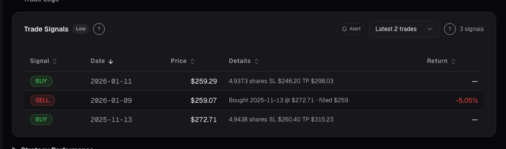
Post-trade review with news annotations. After every closed trade, pull up the chart with news markers over your holding period. Annotate what you knew when. Did you enter before or after the event that moved the stock? Was the loss due to a headline you could have seen or one that nobody saw coming? This review is the fastest possible feedback loop on your research process. Wins teach you what catalyst types you're good at; losses teach you which ones you need to screen for better.
Pre-trade review for long-duration holds. Before sizing into a name you plan to hold for weeks or months, scroll the news annotations over the trailing 12 months. Look for clustering around events you wouldn't have anticipated, class-action lawsuit filings, FDA decisions, management changes. If the stock is prone to event-driven vol every few months, you're not buying a quiet name, and your position size needs to account for that. The chart annotations expose the event density in a way quarterly statements don't.
Compare cluster density to regime. A stock's news cluster density tends to correlate with its realized volatility regime. When a typically-quiet name suddenly enters a cluster of headlines (three or more material events in a two-week window), the regime is shifting. Usually this corresponds to an inflection in the business, new product cycle, litigation, management turnover, and it's worth taking the regime shift seriously even if any single headline looks innocuous. The density pattern is often more informative than the sentiment of any individual piece.
What the materiality filter gets wrong
Like any filter, it misses sometimes. Specifically:
- Pre-announcements buried in SEC filings that later get coverage often don't appear at the filing timestamp, only at the coverage timestamp. For 8-K enthusiasts, this is a small lag.
- Non-English headlines on companies with international exposure are under-indexed relative to their market impact.
- Specialist industry pubs (trade journals, FDA Blue Book updates) get less weight than general wires even when they're more informative for a specific ticker.
For most names this doesn't matter. For names with heavy international exposure or specialist-industry dynamics, pair the card with the Sentiment News full feed rather than relying on the chart overlay alone.
Example: a lesson from a bad trade
In late 2024 I took a loss on a biotech position and didn't understand why at first. My chart showed a 12% gap down on a Wednesday with no obvious trigger on my end. I pulled up the news-annotated chart: three material markers clustered in a five-day window before the gap. One was a competitor's Phase 3 readout that hadn't been on my radar at all. One was a sell-side downgrade I'd dismissed. One was a short seller's report I hadn't seen. None of the three individually would have stopped me from sizing the position; the three together formed exactly the kind of cluster that should have made me trim before the gap.
That post-mortem changed my process. I now make it a standing rule: if three or more material news markers appear on a position within a two-week window, I review the cluster before adding, regardless of my original thesis. That single rule has saved more trades than any indicator I've added.
Common mistakes
- Charts without news overlays. You're looking at the effect without the cause. Your pattern-recognition will drift toward superstition.
- Assuming the widely-covered news is the most material. An 8-K can move a stock more than a multi-outlet analyst note. Materiality is about impact, not volume.
- Over-filtering. If the materiality filter is set too strict, you'll miss moderate-impact events that compound. Default settings are usually right; loosen only if you're evaluating a high-noise name.
- Ignoring gaps with no marker. An unexplained price move is a research prompt. Either the filter missed something or there's a non-news driver (block trade, index rebalancing). Both are worth investigating.
- Never reviewing your own trades on the chart. The highest-value use of the card is closing the feedback loop on your trading decisions.
Where it fits
For the raw per-ticker news feed, drill from the Chart News card into Sentiment News. For the cross-ticker portfolio view, use Dashboard News. For single-event deep reads, click through to the source publication from the expanded annotation.
FAQ
How far back do the annotations go?
Automatically matches the chart's zoom level. At 5-year zoom the card limits to high-materiality events only to avoid clutter; at 3-month zoom you see high-and-medium by default.
Can I filter to only earnings-related news?
Yes, the filter dropdown supports earnings, M&A, regulatory, analyst action, and management change. These filters stack with the materiality toggle.
What about press releases vs. actual coverage?
Press releases distributed through major wires (PR Newswire, Business Wire, GlobeNewswire) appear at the release timestamp with a publication tag. Journalistic coverage appears at each outlet's publication time. Duplicate stories are deduplicated to the earliest timestamp.
Why don't I see an annotation for a news item I read?
Most likely the item didn't cross the materiality threshold, which usually means it had limited cross-source coverage and no significant post-event price move. You can loosen the materiality filter if you want lower-threshold events visible.
Is this data replayable for backtesting?
Yes, the news archive goes back 5+ years on most covered names. For systematic backtesting, the Sentiment News page supports CSV export of the full annotated timeline.
Related reading
- Chart Advanced Analytics
- Chart Benchmark Relative Strength
- Chart Market Regime Overlay
- Dashboard News Stream
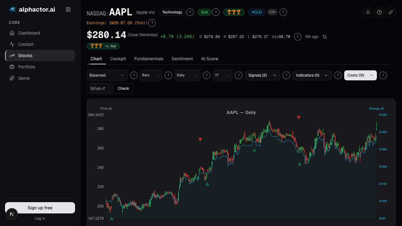
Open the Chart News card → /app/stocks/AAPL/chart
See it in the app
Live dashboard views that match this post. Each tile deep-links to the exact card.
Stocks mentioned
Related reading
5 Candlestick Patterns With Real Statistical Edge
Most candlestick patterns are noise. Research shows only a handful have measurable predictive power, and context matters more than the pattern itself.
Advanced Chart Analytics: Autocorrelation, Seasonality
Beyond moving averages and RSI lives a deeper layer of statistical diagnostics. Hurst exponent, autocorrelation, and seasonality tell you which strategies…
Chart Benchmark: Relative Strength Is Where the Alpha Lives
Absolute price charts hide what's tradeable. Plotting a stock as a ratio against SPY, its sector, or a peer group reveals the idiosyncratic alpha that…
Market Regime on the Chart
Regimes change discretely, but regime models detect them in near-real-time. The Market Regime overlay annotates where the regime flipped so you can see…
Dashboard News: A Filtered Stream Across Your Holdings
Generic news feeds drown you in noise. The Dashboard News card filters by your holdings and ranks by sentiment impact: what's new, what matters, why.
Ready to try alphactor.ai?
Validate your trading strategies with statistical credibility testing. Start free.
Get Started Free