Part of: Technical Analysis
Chart Benchmark: Relative Strength Is Where the Alpha Lives
Absolute price charts hide what's tradeable. Plotting a stock as a ratio against SPY, its sector, or a peer group reveals the idiosyncratic alpha that…
 Jake Morrison7 min read
I've been trading off relative-strength charts since 2010, and the lesson that took me the longest to internalize was this: a stock up 8% looks great on a price chart and looks miserable on a ratio chart if the market was up 12%. The absolute price line tells you what happened to your P&L. The ratio line tells you what happened to your *relative skill at stock selection*, and that's what you can actually build a durable edge on. Once I started leading with ratio charts instead of price charts, I stopped confusing market beta with stock-picking alpha.
This post is about the Benchmark overlay on the chart page, the relative-strength setups that have held up in my trading, and the mistakes I see most often when people first add relative-strength to their workflow.
TL;DR
- Absolute price is market + stock. Relative-strength isolates the stock.
- Sustained ratio uptrends with low correlation = idiosyncratic alpha. The highest-conviction setup.
- Ratio breakouts from long consolidations lead extended outperformance. Classic Minervini/O'Neil, still works.
- Match the benchmark to the thesis. SPY for "does this name beat the market," sector ETF for "does it beat its cohort," peer for "does it beat the direct competitor."
- Look at the correlation strip. A low-correlation, high-relative-strength name is tradeable; a high-correlation, high-relative-strength name is mostly sector beta.
Why relative performance is what trades
When you buy a single stock, you take two bets whether you realize it or not: a market-direction bet (beta) and a stock-selection bet (alpha). The market bet you can get for five basis points of index ETF exposure; it's cheap, abundant, and requires no skill. The stock-selection bet is where any skill you have actually applies, and it's the only part of the trade worth evaluating against your decision-making process.
Plotting a stock as a ratio to a benchmark, literally stock price divided by benchmark price, normalized to a starting point, strips out the market-direction component and shows you the alpha line. If your ratio is flat, you're delivering zero alpha, regardless of what the absolute price looks like; the stock is riding the market. If your ratio is rising, you're capturing outperformance, even if the absolute price is falling.
The academic literature on this is deep, Asness et al., Jegadeesh & Titman, Moskowitz, but the practical point is simpler: a stock's absolute chart misleads you about its actual relative performance more often than not, and the habit of reading the ratio instead of (or alongside) the absolute chart is a cheap, robust improvement in decision quality.
What the Benchmark card shows
The Chart Benchmark card plots:
- Relative-strength ratio line: the viewed ticker divided by the configured benchmark, normalized
- Ratio moving average: default 50-day; configurable
- Ratio slope indicator: rate of change over trailing 20 days, so acceleration / deceleration is visible
- Benchmark selector: SPY default; one-click to sector ETF (XLK, XLF, etc. auto-detected from GICS sector), peer group (platform-generated similarity set), or user-defined custom benchmark
- Rolling correlation strip: 60-day correlation between the stock and the benchmark, plotted below the ratio
- Log vs. linear scale toggle: log for multi-year comparisons, linear for shorter windows
The correlation strip is the under-appreciated feature. A ratio that's rising while correlation is low means genuine stock-specific alpha; a ratio that's rising while correlation is high means sector or factor exposure dressed up as alpha.
Two setups that hold up
Sustained ratio uptrend with low correlation. The highest-conviction relative-strength setup. The ratio is climbing steadily (say, 50-day slope positive for four or more consecutive months), and the rolling correlation with the benchmark is below 0.5. That combination means the stock is rising for reasons specific to the stock, not because its sector or the market is rising. These are the setups where good fundamental work compounds with good technical timing, the name is doing something uniquely that isn't just beta. The post-pattern drift on high-conviction relative-strength winners has held up across decades of academic replication.
Ratio breakout from long consolidation. Two to three months of the ratio trading sideways in a tight range, followed by a clear breakout of the range with volume confirmation. This is the Mark Minervini / William O'Neil school of trading, relative-strength breakouts preceding extended multi-month outperformance runs. The pattern works better on names already in defined absolute-price uptrends, which is the condition Minervini called the "stage 2 advance." A ratio breakout on a stock in absolute-price downtrend is less reliable, because the broad weakness can drag the stock even while it outperforms peers.
What doesn't work
- Short-window ratio spikes. A single-week ratio jump of 5–10% is usually noise or an earnings reaction; it rarely sustains. Watch at least 4–6 weeks before calling it a setup.
- Ratio trading without checking correlation. A "rising" ratio against a benchmark the stock is 0.9-correlated with isn't alpha, it's a factor drift. Low correlation is what makes the ratio informative.
- Benchmarking to the wrong index. NVDA vs. SPY in 2022–2023 was alpha; NVDA vs. SOX (semiconductor index) was closer to a wash. The choice of benchmark decides what question you're answering.
- Ratio charts on tiny-cap names. Below a few hundred million in market cap, the ratio is dominated by liquidity and microstructure noise, not real relative performance.
Choosing the benchmark
The benchmark decides what question the ratio answers. Three defaults I use:
- SPY: "Does this name beat the market?" The broadest question. Good for portfolio-level allocation decisions, is this position worth the slot vs. a passive index allocation.
- Sector ETF (XLK, XLF, XLV, etc.): "Does this name beat its cohort?" The question a sector specialist asks. If I'm long three names in a sector, I want to know which one is carrying the sector rather than riding it.
- Direct peer (e.g. NVDA vs. AMD, AAPL vs. MSFT): "Does this name beat its closest competitor?" The question for pairs-trade or factor-bet framing. A good pair has low correlation with the broad market and high correlation between the two pair legs.
Custom benchmarks (a market-cap-weighted basket, a factor-ETF you care about) are available too but rare in my daily workflow. SPY / sector / peer does 90% of the work.
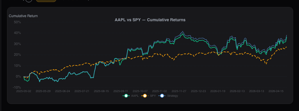
Example: a relative-strength setup in Q2 2025
In May 2025 I was watching a mid-cap software name that had gone sideways on an absolute price basis for three months. The ratio chart against its sector ETF told a different story: the ratio had been rising for the same three months, slope positive throughout, correlation with the sector sitting around 0.35. Translation: the stock was outperforming its sector while the absolute price looked quiet, because the sector had been slowly grinding lower and the stock had held flat. That's the textbook "relative-strength uptrend with low correlation" setup.
I bought the position on a minor breakout of the absolute-price range, with a 6% stop. Over the next ten weeks the stock rallied 22% while the sector rallied 8%. The setup wasn't a prediction; the setup was a recognition that the ratio was doing something the absolute chart was hiding, and the ratio pattern has a durable base rate in academic literature. When the ratio eventually rolled over in August, I trimmed half, because the setup that originally got me in had ended.
Common mistakes
- Reading absolute price charts in isolation. You see market + stock, not stock. Always pull the ratio.
- Confusing sector beta for alpha. If your stock is up but so is the sector ETF, you haven't picked a winner, you've bought the sector. Check the ratio.
- Ignoring the correlation. A rising ratio with 0.85 correlation is factor drift, not idiosyncratic alpha.
- Trading ratio breakouts without volume confirmation. Low-volume ratio breakouts reverse disproportionately often. Wait for the volume.
- Benchmarking to an index that doesn't match the thesis. AAPL vs. SPY answers one question; AAPL vs. MSFT answers a different one. Pick benchmark to match the thesis.
Where it fits
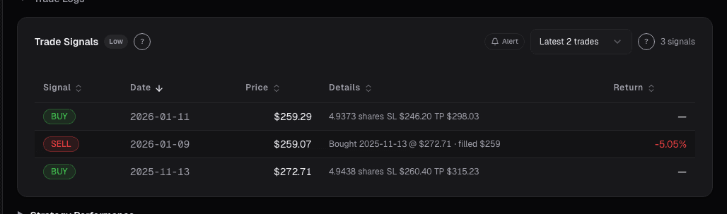
The Benchmark card pairs with Trade Signals for single-name technical confirmation, Volume Profile for the structure beneath the price, and Advanced Analytics for the statistical character of the ratio itself. For the fundamental-side complement, use the Peer Comparison card.
FAQ
How far back should I look at the ratio?
Multi-year on log scale for long-term view, 6–12 months on linear scale for setup identification. Very short windows (< 3 months) have too much noise to be useful.
Does relative-strength work on shorts?
Yes, symmetrically. A sustained ratio downtrend with low correlation is the short equivalent of the long-side setup. The base rates are similar, though short setups are often more sensitive to short-squeeze risk so sizing is smaller.
Which benchmark is best for mid-caps?
Typically the sector ETF rather than SPY, because SPY is dominated by mega-caps whose factor exposures differ from mid-caps. XLF for a mid-cap bank, XLK for a mid-cap software name, etc. If no sector ETF is a good fit, a custom mid-cap index works.
How do I handle stocks that don't fit any sector cleanly?
Multi-sector conglomerates and financial-services hybrids are the hard cases. Use a custom benchmark or compare to the GICS industry-group ETF (more granular than sector). When in doubt, compare to SPY and note that the comparison is less clean.
Do you use relative-strength for entries or for selection?
Both. Selection first, I'd rather hold five names with positive relative-strength over five with negative. Entry second, even a long-term "hold" gets better P&L if you wait for the ratio to confirm rather than buying into ratio weakness.
Related reading
- Chart Advanced Analytics
- Chart Market Regime Overlay
- Chart News Annotations
- Choosing the Right Benchmark
Open the Benchmark card → /app/stocks/AAPL/chart
See it in the app
Live dashboard views that match this post. Each tile deep-links to the exact card.
Stocks mentioned
Related reading
Choosing the Right Benchmark (Hint
Why benchmarking against the wrong index distorts your performance assessment and how to select a benchmark that matches your actual portfolio.
Advanced Chart Analytics: Autocorrelation, Seasonality
Beyond moving averages and RSI lives a deeper layer of statistical diagnostics. Hurst exponent, autocorrelation, and seasonality tell you which strategies…
Market Regime on the Chart
Regimes change discretely, but regime models detect them in near-real-time. The Market Regime overlay annotates where the regime flipped so you can see…
News Annotations on the Chart: Tying Headlines to the Tape
A price move without a reason is just a squiggle you'll misread later. The News card annotates the chart with material headlines at their exact publication…
Choosing the Right Benchmark
Most retail investors benchmark against the S&P 500 out of habit. The wrong benchmark makes mediocre returns look great and good returns look ordinary.
Relative Strength (Not RSI)
Why comparing a stock's performance against SPY, its sector, and its peers is a stronger signal than any oscillator for identifying future outperformers.
Ready to try alphactor.ai?
Validate your trading strategies with statistical credibility testing. Start free.
Get Started Free