Part of: Technical Analysis
Advanced Chart Analytics: Autocorrelation, Seasonality
Beyond moving averages and RSI lives a deeper layer of statistical diagnostics. Hurst exponent, autocorrelation, and seasonality tell you which strategies…
 Jake Morrison7 min read
The most expensive trade I ever put on was a pullback buy in a stock with a Hurst exponent of 0.72. The setup looked perfect, RSI at 38, price at the 50-day, oversold on every short-term oscillator I had. The stock fell another 14% over the next three weeks without a meaningful bounce. I was trying to mean-revert a trending name. The indicators I was staring at were designed for a different statistical regime than the one the stock was actually in. That taught me more about the limits of "standard" technical analysis than any textbook ever did.
This post is about the second layer of chart analytics, the statistical character underneath the visible price action. Not the moving averages, RSI, and MACD every platform ships with, but the diagnostics that tell you which of those indicators you should bother running on this particular name right now.
TL;DR
- Moving averages and RSI assume a character you often don't have. They work great on some names and terribly on others, and you need to check first.
- Hurst exponent is the single most useful diagnostic. < 0.45 mean-reverting, > 0.55 trending, 0.45–0.55 random, pick your strategy from there.
- Kurtosis and skew change how you size. Fat-tailed, negatively skewed names need 30–50% smaller positions than naive vol-targeting implies.
- Seasonality is real at the calendar edges. Turn-of-month, FOMC weeks, and earnings drift are the robust ones. Day-of-week effects mostly aren't.
- Regime-stratified stats beat all-sample stats. A stock can be a trender in risk-on and a mean-reverter in risk-off, treat those as different securities.
When standard indicators aren't enough
RSI, MACD, Bollinger Bands, and the rest of the standard indicator kit share a hidden assumption: that the underlying return series has roughly stable statistical properties (fat but not extreme tails, weak short-term autocorrelation, finite variance). That assumption is fine as an approximation *on average across the market,* but it fails badly on specific names in specific regimes. Trend-following indicators run on a mean-reverting name generate whipsaws. Mean-reversion indicators run on a trending name generate a stream of losing pullback buys. The indicator isn't broken; the indicator is the wrong tool for the character of the series you're trading.
The Advanced Analytics card is the instrument you use *before* you pick indicators. It answers the question "what kind of name am I actually looking at" with numbers, so you can choose whether the chart-level tools you're about to layer on even make sense.
What the Advanced Analytics card shows
The Chart Advanced Analytics card reports:
- Hurst exponent (0–1, with standard-error band)
- Autocorrelation function at lags 1, 2, 3, 5, 10, and 20 days, with significance shading
- Return distribution statistics: mean, standard deviation, skew, excess kurtosis, Jarque-Bera normality test
- Seasonality decomposition: turn-of-month, day-of-week, FOMC-week, and month-of-year effects with bootstrap confidence intervals
- Implied vs. realized volatility ratio on rolling 30- and 60-day windows
- Regime-stratified recomputation: every statistic above, re-computed inside each market regime separately
The card is designed for the "glance, then dig in" workflow: first the regime-unweighted summary so you know the base character, then the regime-stratified version so you know how the character shifts in risk-on vs. risk-off environments.
Reading the statistics
Hurst exponent is the single most actionable number on the card. The calibration I use:
- Hurst < 0.45: mean-reverting. Pullback entries, Bollinger-band fades, and RSI mean-reversion setups are in their natural environment. Breakout trades tend to fail.
- Hurst between 0.45 and 0.55: essentially random. Neither trend-following nor mean-reversion has robust edge. If I trade these at all, I trade them around catalysts, not technicals.
- Hurst > 0.55: trending. Breakouts, pyramid-adds on strength, and ATR-based trailing stops are in their natural environment. Pullback-buy strategies are exactly the wrong template.
A caveat: Hurst is noisy on short windows. I want at least 250 daily observations (one trading year) before I trust it, and I want the standard-error band to exclude 0.5 before I commit to a characterization.
Kurtosis and skew together tell you whether your position-sizing model is lying to you. If excess kurtosis is above 3 (so total kurtosis > 6) *and* skew is negative, the realized tail risk is meaningfully worse than a normal approximation implies. Standard vol-targeting (size so that 1-day 1% VaR = some fraction of portfolio) will under-reserve for drawdowns by roughly 30–50% on these names. I apply a fat-tail haircut, literally, I scale my nominal position by 0.7, when kurtosis > 5 with negative skew.
Seasonality is the most abused statistic on the card. The robust effects are:
- Turn-of-month effect, last two and first three trading days of the month have statistically higher mean returns than the middle. Real, well-documented, modest in size.
- FOMC announcement-day drift, intraday pre-announcement drift on scheduled FOMC days. Real, documented in academic literature (Lucca & Moench).
- Earnings post-announcement drift, 60-day drift following earnings surprises. Real, one of the oldest documented anomalies.
The noisy ones are day-of-week effects. Modern data largely fails to replicate the Monday-effect and related folklore. If the seasonality module shows a significant day-of-week pattern, I treat it as a multiple-testing artifact unless it's extreme.
IV/RV ratio above 1.3 with a falling trend suggests the options market has priced in more vol than is being realized, and the stock is grinding toward a regime where trend-following will work. Below 0.8 with a rising trend suggests realized vol is overshooting implied and mean-reversion setups are more likely to work. Neither is a standalone signal; both are context.
Regime-stratified vs. all-sample
This is the feature I use most. A concrete example: NVDA over the 2022–2025 period had an all-sample Hurst near 0.55 (weakly trending). Stratified, it was 0.68 in risk-on months and 0.41 in risk-off months. Same stock, two completely different statistical characters depending on the macro regime. That means the "right" chart strategy on NVDA changed with regime, not with price, and the regime-stratified card made that visible.
The lesson is that all-sample statistics blend regimes and give you a number that's correct on average and wrong in every specific instance. If you only look at one, make it the regime-stratified one.
Example: two retail-favorite names
In early 2025 I looked at GME and AAPL on the same day, same length of history.
- GME: Hurst 0.38 (mean-reverting), excess kurtosis 12, skew -0.4. Translation: chop with occasional face-rippers. Mean-reversion setups are the character match, but size small because the tails will take you out if you're not careful.
- AAPL: Hurst 0.56 (weakly trending), excess kurtosis 1.9, skew 0.1. Translation: well-behaved, weakly trending, approximately normal returns. Standard trend-following, standard sizing.
Same chart platform, same indicators available, same session. Two completely different statistical regimes. Running the same RSI-pullback strategy on both would have been a disaster on GME and fine on AAPL. The diagnostics told me that before I pulled up either chart.
Common mistakes
- Trusting Hurst on short history. Under 250 observations the standard error is wide enough that you're often reading noise. Wait for the window.
- Ignoring the regime stratification. The all-sample Hurst is almost always less useful than the regime-stratified one.
- Treating seasonality bullets as trade triggers. They're base-rate adjustments to your edge, not entries on their own.
- Using vol-targeting without a fat-tail haircut on kurtotic names. You'll survive most months and blow up in the one you didn't size for.
- Expecting stationarity. A stock's character changes, sometimes gradually, sometimes abruptly on a business model shift. Re-run the diagnostics quarterly.
Where it fits
The Advanced Analytics card is the diagnostic under every technical decision on the chart. Combine with Trade Signals for execution, Market Regime Overlay for macro context, and Volume Profile for the structural layer beneath the price. For portfolio-level versions of these statistics, use the Portfolio Risk Metrics card.
FAQ
How long of a window do I need for Hurst?
At least 250 daily observations, preferably 500. Shorter windows have too much standard error to separate 0.45 from 0.55 reliably.
Does any of this work on intraday data?
Some of it. Hurst and autocorrelation are defined on intraday too, but intraday data has microstructure effects (bid-ask bounce creates negative autocorrelation at lag 1 that isn't a mean-reversion signal). The seasonality decomposition is not intraday-meaningful.
Why excess kurtosis rather than total kurtosis?
Convention. Normal distribution kurtosis is 3; "excess" subtracts that so 0 = normal. Both numbers are fine if you're consistent; the card shows excess.
How often does a stock's character change?
Gradually by default, you can usually see a name drift from one regime to another over 1–2 years. Abruptly around business-model events (spinoffs, acquisitions that change margins, macro regime shifts). Recomputing quarterly catches most of it.
Is the IV/RV ratio a trade signal?
No, it's context. A stretched ratio tells you the options market and realized vol are disagreeing, which is useful background when sizing trades, but by itself it's not actionable without a view on which side is right.
Related reading
- Chart Benchmark Relative Strength
- Chart Market Regime Overlay
- Chart News Annotations
- Choosing the Right Benchmark
Open the Advanced Analytics card → /app/stocks/AAPL/chart
See it in the app
Live dashboard views that match this post. Each tile deep-links to the exact card.
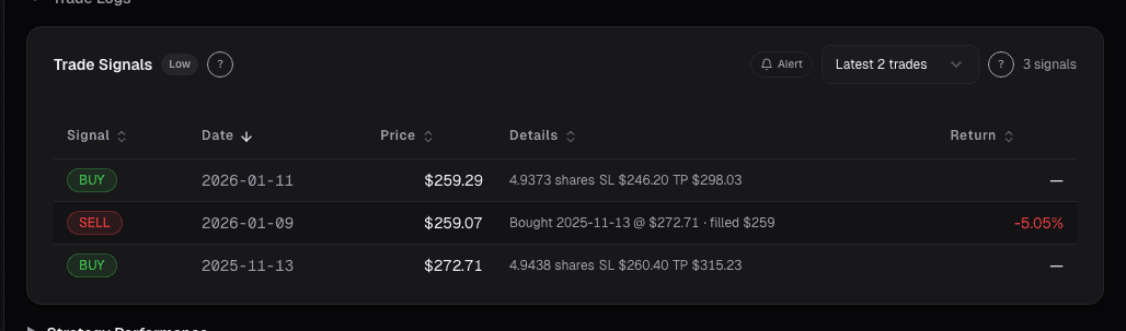
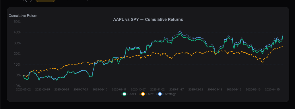
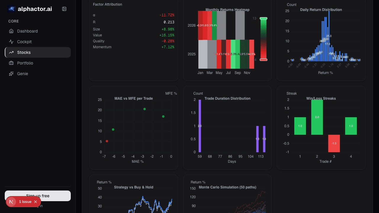
Stocks mentioned
Related reading
Brinson Attribution: Did You Pick Good Stocks
Brinson-Fachler splits active return into allocation, selection, and interaction so you can tell whether outperformance came from sector bets or stock-picking.
Chart Benchmark: Relative Strength Is Where the Alpha Lives
Absolute price charts hide what's tradeable. Plotting a stock as a ratio against SPY, its sector, or a peer group reveals the idiosyncratic alpha that…
Market Regime on the Chart
Regimes change discretely, but regime models detect them in near-real-time. The Market Regime overlay annotates where the regime flipped so you can see…
News Annotations on the Chart: Tying Headlines to the Tape
A price move without a reason is just a squiggle you'll misread later. The News card annotates the chart with material headlines at their exact publication…
Choosing the Right Benchmark
Most retail investors benchmark against the S&P 500 out of habit. The wrong benchmark makes mediocre returns look great and good returns look ordinary.
Value at Risk in Plain English
VaR is the most widely used risk metric in finance. It is also the most misunderstood. Here is what it actually means and where it fails.
Ready to try alphactor.ai?
Validate your trading strategies with statistical credibility testing. Start free.
Get Started Free