Market Breadth: The Health Check Most Investors Skip
How advance-decline lines, new highs-lows, and participation rates reveal whether a rally is built on solid ground or propped up by a handful of stocks.
 Marcus Chen4 min read
When the Index Lies
In the first half of 2023, the S&P 500 rose over 15%. Headlines proclaimed a new bull market. But beneath the surface, the rally was almost entirely driven by seven stocks: Apple, Microsoft, Alphabet, Amazon, Nvidia, Meta, and Tesla. The equal-weighted S&P 500, which gives every stock the same influence, was roughly flat over the same period.
This divergence was not a curiosity. It was a warning. When an index rises but most of its constituents do not participate, the rally is narrow, fragile, and historically prone to reversal. Market breadth, the percentage of stocks participating in a move, is the single best diagnostic tool for distinguishing a healthy advance from a hollow one.
What Breadth Measures
Breadth indicators answer a simple question: is the market moving because most stocks are moving, or because a few heavyweights are dragging the index?
Advance-decline line: The cumulative count of advancing stocks minus declining stocks on a given exchange. When the A/D line rises alongside the index, the advance is broad and healthy. When the index makes new highs but the A/D line fails to confirm, fewer soldiers are marching. This divergence preceded the 2000 top by five months, the 2007 top by seven months, and the 2022 top by roughly three months.
Percentage of stocks above their 200-day moving average: This measures how many stocks are in individual uptrends. In a healthy bull market, more than 60% of stocks are typically above their 200-day average. When that percentage drops below 40% while the index is still rising, concentration risk is extreme. In November 2021, despite the S&P 500 hitting all-time highs, only 55% of its components were above their 200-day moving average, signaling the deterioration that became the 2022 bear market.
New highs minus new lows: The number of stocks hitting 52-week highs minus those hitting 52-week lows. In a strong market, new highs should expand as the index advances. When the index pushes higher but new highs contract, the generals are marching without their troops.
Historical Parallels
The relationship between breadth and subsequent returns is one of the most well-documented patterns in market history.
The 1999-2000 period is the canonical example. The Nasdaq Composite rose 85% in 1999, but the median Nasdaq stock was already declining by mid-year. The index was carried by a dozen mega-cap internet stocks while thousands of smaller names were rolling over. When the bubble burst, the prior breadth deterioration made it clear in hindsight that the rally had been dying from the inside out for months.
The 2007 top showed a similar pattern. The S&P 500 peaked in October 2007, but the advance-decline line peaked in June. Financials, which would later be the epicenter of the crisis, were already underperforming significantly. The divergence gave investors nearly four months of warning.
More recently, the October 2023 low produced the opposite signal. As the S&P 500 rallied from its correction low, breadth expanded dramatically. New highs surged, the advance-decline line confirmed the move, and more than 70% of stocks moved above their 200-day average. That broad participation helped sustain the rally through the end of the year.
Using Breadth in Practice
Breadth is most valuable as a confirmation tool. When you see the index moving, ask whether breadth confirms or contradicts the move.
Confirming breadth: Index rising, A/D line rising, new highs expanding, most sectors participating. This is a green light for trend-following strategies. Stay long, buy dips.
Deteriorating breadth: Index rising, but A/D line flattening, new highs contracting, and fewer sectors participating. This is a yellow light. Reduce position sizes, tighten stops, and avoid adding new risk. The rally may continue for weeks or months on the back of mega-cap strength, but the probability of a broader correction is rising.
Collapsing breadth: Index falling, A/D line falling, new lows exploding. This is the red zone. Capital preservation is the priority. However, watch for a breadth thrust, a sudden expansion where advancing stocks outnumber declining stocks by more than 2:1 for several consecutive days. This pattern, first described by Martin Zweig, has been one of the most reliable buy signals in market history.
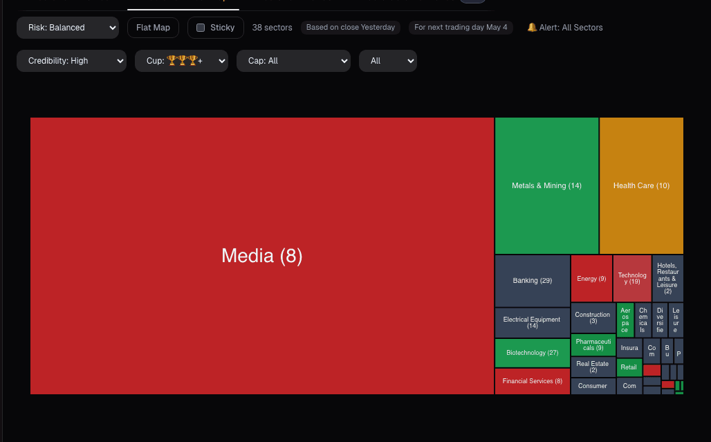
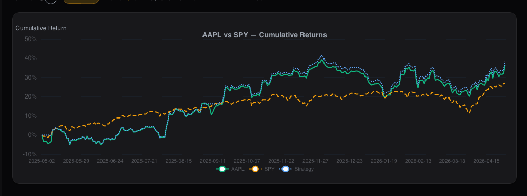
The universe scanner provides an intuitive visual of breadth across sectors and individual stocks. When most tiles are green and getting greener, breadth is expanding. When green is concentrated in a few large tiles while the majority are red, the index is masking underlying weakness.
The Breadth Thrust Signal
The most powerful breadth signal is the rarest. A breadth thrust occurs when the 10-day advance-decline ratio surges from oversold to overbought within a compressed window. Historically, this has happened at the beginning of every major bull market since 1950.
In October 2022 and again in November 2023, breadth thrust conditions were met. In both cases, the S&P 500 delivered strong returns over the following twelve months. The thrust works because it represents a violent shift in participation that typically marks the start of a new uptrend.
Breadth provides a diagnostic that price alone cannot. The index can be manipulated by flows into a handful of mega-cap names. Breadth cannot. Layer it with Alphactor charts to see whether individual stock technicals confirm or contradict the breadth signal.
See it in the app
Live dashboard views that match this post. Each tile deep-links to the exact card.
Stocks mentioned
Related reading
ADX: How to Measure Whether a Trend Is Worth Trading
ADX measures trend strength, not direction. Here is how to use it with directional indicators to identify trending markets and avoid costly whipsaws in ranges.
ATR for Position Sizing
How Average True Range normalizes risk across stocks, sets intelligent stop losses, and determines position size based on volatility, not gut feeling.
The Bollinger Band Squeeze
Bollinger Band squeezes predict volatility expansions. Here is how to identify them, measure their intensity, and avoid the false breakouts.
Dark Pool Activity: Reading the Institutional Order Flow
What dark pools are, why institutions use them, and how tracking dark pool prints and volume can reveal where smart money is positioning before it shows up…
Market Signals on the Dashboard: Macro Context in One Card
Every stock trade is partially a macro trade whether you want it to be or not. The Market Signals card condenses breadth, volatility, rates, and leadership…
On-Balance Volume: The Simplest Way to Spot Accumulation
OBV tracks whether volume flows into or out of a stock. When OBV diverges from price, someone knows something you do not.
Ready to try alphactor.ai?
Validate your trading strategies with statistical credibility testing. Start free.
Get Started Free