Part of: Fundamental Analysis
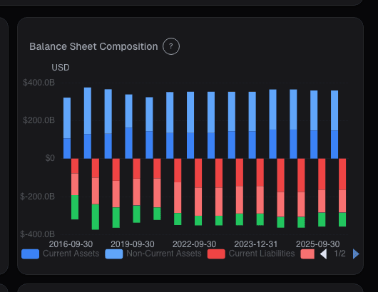
Balance Sheet Chart: Assets, Debt, and Equity Over Time
A single quarter's balance sheet hides the trajectory. A company can look fine today while quietly levering up 3 turns over 5 years, or sitting on a growing…
 Sarah Patel7 min read
In late 2021 I was doing due diligence on an industrial conglomerate that had been a long-time favorite of value managers. The most recent balance sheet looked fine, healthy cash position, manageable leverage ratios, equity growing reasonably. My default reading workflow is to snap back to the 10-year balance-sheet chart before getting comfortable with any single period, and that view told an entirely different story. Over five years, goodwill had grown from 8% of total assets to 29%. Long-term debt had doubled. Common equity had grown by half of the goodwill-growth, meaning the company had funded most of the acquisitions with debt, not stock. Operating performance of the acquired businesses was visible only in the segment disclosures, and two of the last three deals were underperforming plan. Six months later the company announced a $1.8B goodwill impairment on the weakest acquisition; the stock lost 28% in the following quarter. The impairment wasn't surprising to anyone who'd looked at the 10-year chart; it was surprising to everyone who had only looked at the most recent quarter. The snapshot hides the story; the trend reveals it.
This post is about the Balance Chart card, why a decade of trajectory is the unit of analysis that generates signal, and the three patterns that separate healthy capital-structure evolution from the kind that ends in impairments or refinancing crises.
TL;DR
- A single quarter is a point; capital structure is a trajectory. Read both or you miss half the story.
- Goodwill growing faster than total assets flags acquisition-heavy strategy. Fine if deals perform, dangerous if impairments loom.
- Cash pile growing without capex or buyback response signals management doesn't know what to do, usually resolved by a low-quality deal or sudden return.
- Steady net-debt growth with flat revenue = capital structure drifting without the operating business catching up.
- Annotation layer for M&A events makes inflections interpretable rather than mysterious.
A snapshot hides the story
One balance-sheet snapshot tells you the current state. It hides the trend, whether the company has been healing or decaying, whether debt is rising or falling, whether the equity growth is real or goodwill-stuffed from acquisitions that haven't earned their cost of capital. The trend view (10+ years, assets decomposed into their components, capital structure decomposed separately) reveals a set of patterns that the snapshot can't show.
The specific information the snapshot loses:
- Direction of capital structure changes: is leverage increasing or decreasing?
- Source of equity growth: retained earnings vs. share issuance vs. acquisition-funded goodwill
- Whether cash accumulation is productive (funding growth capex, buybacks) or idle (sitting on the balance sheet, becoming a deal-flow time bomb)
- Pattern of goodwill growth: is the company a serial acquirer, and are the acquisitions adding economic value or just accounting balance?
- Working-capital dynamics: rising DSO / DIO over multiple years signals a business that's extending credit to customers or building inventory it can't sell
A 10-year chart makes all of these visible at a glance. Pulling the equivalent information from comparing 10 individual snapshot balance sheets is mechanically possible but cognitively expensive; most analysts don't do it, and the ones who do are the ones who catch the patterns before they show up as impairments.
What the Balance Chart shows
The Balance Chart card plots the full 10-year (or longer, where available) balance-sheet history:
- Total assets stacked area: cash + receivables + inventory + PP&E + goodwill + intangibles + other
- Capital structure below the line: short-term debt + long-term debt + other liabilities + common equity
- Toggles: absolute dollars, % of total assets, year-over-year growth rates
- Key-event annotations: major acquisitions, spin-offs, buyback announcements, dividend initiations, marked on the timeline so inflection points are interpretable
- Trailing 10-year CAGR for each component, so you can see whether goodwill growth is outpacing asset growth
- Per-segment drill-down for multi-segment companies, segment-level asset allocation over time
Three patterns that matter most
Goodwill growth outpacing asset growth. An acquisition-heavy strategy shows up as goodwill growing much faster than organic asset growth. This is fine if the acquired businesses generate returns on capital that justify their purchase price. It's dangerous if the acquisitions are underperforming, at some point the goodwill impairment arrives, and the size of the impairment is proportional to the accumulated over-payment. When I see goodwill above 25% of total assets and still growing, I always cross-check with Altman Z and segment operating-margin trends.
Rising cash pile with no capex or buyback response. Cash accumulation is only valuable if the company has a use for it. A cash pile growing over 3+ years without a corresponding rise in capex, R&D, buybacks, or dividends signals management hasn't figured out capital allocation. These situations almost always resolve in one of two ways: a value-destroying M&A deal (management bored, board pressure to "do something") or a sudden large return of capital (special dividend, accelerated buyback). Both outcomes are worth preparing for.
Steady net-debt growth with flat revenue. The combination of rising debt and flat or declining top-line growth means the capital structure is drifting without the operating business catching up. Often the debt is funding buybacks or dividends, which optically looks shareholder-friendly but is financial-engineering in disguise. When rates rise, these companies' interest expense balloons and the Rule-of-40 / FCF-yield story deteriorates rapidly.
Example: the 2021 acquisition-heavy conglomerate
Ten-year summary of the company I flagged in the intro:
| Year | Total assets | Goodwill | Goodwill / TA | Long-term debt | Revenue |
|---|---|---|---|---|---|
| 2016 | $12.4B | $1.0B | 8% | $2.8B | $4.1B |
| 2017 | $13.1B | $1.4B | 11% | $3.2B | $4.3B |
| 2018 | $14.2B | $2.1B | 15% | $3.9B | $4.5B |
| 2019 | $15.6B | $2.9B | 19% | $4.8B | $4.7B |
| 2020 | $16.8B | $3.8B | 23% | $5.6B | $4.9B |
| 2021 | $18.1B | $5.2B | 29% | $6.1B | $5.1B |
Goodwill grew from $1.0B to $5.2B (5.2× in 5 years). Total assets grew from $12.4B to $18.1B (1.5×). Revenue grew from $4.1B to $5.1B (1.24×). Goodwill absorbed most of the asset growth; the operating business barely grew at all. Debt grew to fund it. This is the classic acquisition-heavy serial-deal pattern that almost always ends in impairment. The impairment when it came was $1.8B, roughly matching my back-of-envelope estimate from the chart.
What the chart can miss
- Off-balance-sheet items. Operating leases (pre-ASC 842), SPVs, minority interests in joint ventures. The chart reflects consolidated balance sheet only.
- Fair-value vs. book-value. Some balance-sheet lines (PP&E, inventory) are at book; their economic value may differ materially.
- Foreign-currency effects. Multinational balance sheets are translated at period-end rates; large FX swings can move the chart without underlying operational change.
- Intangible assets economic life. Amortization schedules are accounting-defined; actual economic life of intangibles may differ.
- Contingent liabilities. Litigation exposure, warranty reserves, environmental liabilities, often in the footnotes but not on the chart.
Common mistakes
- Reading only one period. The trend is always more informative than the snapshot.
- Ignoring the annotation layer. M&A events explain most sharp inflections; without context, the chart looks mysterious.
- Focusing on total assets without decomposing. A company can grow total assets 50% while the productive asset base (PP&E, working capital) is flat and everything is goodwill.
- Comparing equity growth without source. Equity from retained earnings is higher-quality than equity from acquisition-funded goodwill.
- Missing working-capital creep. Receivables and inventory growing faster than revenue is a quiet signal; the chart exposes it across multiple years.
Where it fits
Pair with the Balance Sheet deep-dive card for the line-item view, Leverage for the debt-ratio trend, and Altman Z for the bankruptcy-risk composite. On the income side, combine with Revenue and Margin charts for the full operating + capital story. For the cash-flow side, Cashflow Waterfall shows how operating cash translates to free cash, which is the input funding most capital-structure changes.
FAQ
How far back does the chart go?
10 years by default; up to 20 years where long-run data is available. Shorter histories are flagged.
How often does it update?
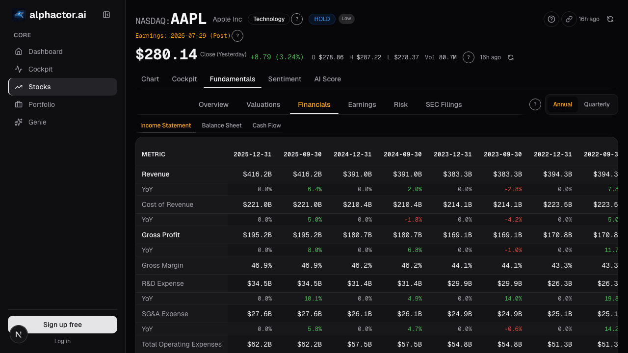
On filing. 10-Qs quarterly and 10-Ks annually. The card updates within hours of SEC filing.
What's "other" on the assets line?
Items not individually material enough to break out, deferred tax assets, prepaid expenses, short-term investments. The card lets you expand "other" to see the specifics.
Does this work for banks and insurers?
Partially, the balance-sheet composition differs substantially (loans, deposits for banks; reserves, float for insurers). The card supports sector-specific views for financials.
Can I export the data?
Yes, CSV and XLSX exports with full history and all line items.
Related reading
- Balance Sheet Capital Structure
- Accruals Quality, Earnings Manipulation
- Altman Z, Bankruptcy Risk
- Cashflow Waterfall, Operating to Free
Open the Balance Chart → /app/stocks/AAPL/fundamentals
See it in the app
Live dashboard views that match this post. Each tile deep-links to the exact card.

Stocks mentioned
Related reading
Accruals Quality: How to Spot Earnings That Aren't Real
Accruals measure the gap between reported earnings and actual cash. Widening accruals is one of the most reliable red flags in financial analysis, Sloan's…
Altman Z-Score: A Bankruptcy Predictor That Still Works
Edward Altman's 1968 discriminant model predicts bankruptcy within two years about 72% of the time at its distress threshold.
Balance Sheet Deep Dive
Balance sheet changes lead income statements by 2-6 quarters. Net debt, receivables days, and goodwill are the lines that move stocks first.
Price-to-Book Value: Useful for Banks, Misleading for Tech
Price-to-book works for banks and asset-heavy industrials but misleads for software. Here is how to apply it correctly by sector and when to skip it.
Cashflow Waterfall: From Operating Cash to Free Cash
Operating cash flow is cleaner than net income but still not distributable cash. The waterfall makes every deduction visible, SBC, working capital, capex …
Ready to try alphactor.ai?
Validate your trading strategies with statistical credibility testing. Start free.
Get Started Free