Part of: Fundamental Analysis
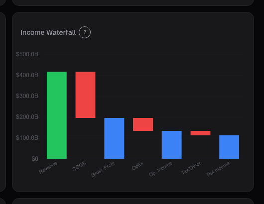
Income Statement Waterfall
A waterfall chart makes margin composition visible at a glance. How to separate durable margin expansion from a pull-forward that breaks within 18 months.
 Sarah Patel7 min read
I've run the same drill on hundreds of earnings releases: read the press release summary, then open the income waterfall for the same company's TTM and compare it to the prior-year TTM waterfall side-by-side. The comparison surfaces something a table view almost always hides, which cost center is actually responsible for the margin change the release is celebrating. In Q2 2023 I ran the drill on a consumer products company that had just reported 220 bps of operating margin expansion. The release emphasized pricing discipline and "structural efficiency gains." The waterfall told a different story: gross margin was actually flat YoY. S&M had dropped 310 bps as a share of revenue. R&D had dropped 70 bps. G&A was essentially flat. The entire operating-margin expansion was coming from reduced investment in brand-building and product development, not from underlying business improvement. Fifteen months later the company missed two quarters in a row on decelerating revenue growth; the pull-forward in S&M had thinned the marketing pipeline exactly as the S&M-drop pattern usually signals. The press release described "efficiency"; the waterfall described "harvest mode." Both were technically accurate, but only one was useful for predicting future quarters.
This post is about the Income Waterfall card, what a waterfall shows that a table can't, and the three comparisons that distinguish durable margin expansion from the kind that breaks within 18 months.
TL;DR
- A waterfall sizes bars by dollar magnitude, making margin composition obvious at a glance.
- Gross margin YoY change ≥ ±200 bps is material: usually pricing, mix, or input-cost-driven, and often multi-quarter.
- Opex mix shift matters more than opex total. S&M leverage down + R&D up is different from the reverse, same total.
- Operating margin bridge in $ vs. % tells you whether expansion is scale (compounds) or efficiency (often doesn't).
- S&M drop without revenue deceleration is a pull-forward flag: future quarters usually pay for it.
What a waterfall gives you that a table doesn't
A standard income statement table is accurate but cognitively flat, every line is one row tall. The reader has to do the arithmetic in their head to understand which cost centers are large and which are small. A waterfall chart sizes each bar to its actual dollar magnitude, so COGS (usually the biggest chunk) visually dominates, and R&D (often smaller than casual readers expect, even in tech) looks small.
That visual weighting makes several things immediately obvious:
- Gross margin as the dominant profit lever: if the COGS bar consumes 70% of revenue, gross margin changes dwarf operating expense changes
- Opex mix composition: which single opex line is largest (typically S&M for growth names, G&A for mature names)
- Dollar vs. percentage changes: the YoY change mode highlights margin-point moves while the dollar mode shows which lines grew fastest
- Where the profit actually lives: the final Net Income bar is often a small slice; the "profit" most readers think about is the size of the operating-income bar
A table of the same numbers requires mental math to reconstruct any of this. The waterfall makes it one-second-visible. That efficiency is the main reason I keep the waterfall pinned as the first card I open after reading a release, it's the fastest way to confirm or contradict the release's narrative.
What the Income Waterfall card shows
The Income Waterfall card visualizes the trailing 12 months P&L as a sequence of sized bars:
- Starting at Revenue, stepping through Cost of Revenue → Gross Profit → R&D → Sales & Marketing → G&A → Operating Expenses total → Operating Income → Interest → Taxes → Net Income
- Each step shows both the dollar amount and the percentage of revenue
- Toggle for prior-year same period: swap the current view for the prior-year equivalent to compare
- YoY-change mode highlights which lines moved most as margin points of revenue
- Segment breakdown for multi-segment companies, showing the segment mix within each revenue bar
- Per-bar drill-down tooltip: click any bar to see the underlying line items
Three comparisons that pay off
Gross margin YoY change ≥ ±200 bps. Material gross margin moves reflect pricing, mix, or cost-of-input changes, all of which tend to persist for multiple quarters rather than reversing immediately. A 250 bps gross margin expansion is usually not a one-quarter blip; it's a multi-quarter trend. A 250 bps compression is the same in reverse. Gross margin at the top of the waterfall is the highest-leverage number because it flows through to every line below it.
Opex mix shift. The same total opex % of revenue can be composed very differently. S&M leverage down + R&D up is a different story than S&M down + G&A up, the first suggests the company is shifting investment from short-term demand generation to long-term product development (usually fine), the second suggests management overhead creeping up while growth investment shrinks (usually bad). The waterfall's opex decomposition exposes the mix.
Operating margin bridge in dollars vs. percentages. Margin expansion can come from scale leverage (opex dollars growing slower than revenue, so opex % declines mechanically) or from efficiency (opex dollars flat or declining while revenue is flat). Scale leverage compounds, it keeps working as long as revenue grows. Efficiency gains are one-time, you can only save a given dollar once. Distinguishing them requires reading the dollar change alongside the percentage change. The waterfall's YoY mode makes both visible.
Example: the Q2 2023 consumer products company
The YoY waterfall comparison:
| Step | Q2 2023 (% rev) | Q2 2022 (% rev) | YoY delta |
|---|---|---|---|
| Revenue | 100% | 100% | , |
| Gross profit | 48.2% | 48.0% | +20 bps |
| R&D | 4.1% | 4.8% | -70 bps |
| S&M | 19.8% | 22.9% | -310 bps |
| G&A | 8.4% | 8.1% | +30 bps |
| Operating margin | 15.9% | 12.2% | +370 bps |
Total operating margin expansion of 370 bps, of which gross margin contributed only 20 bps. S&M and R&D together contributed 380 bps of the expansion. The release claimed "structural efficiency"; the waterfall said "reduced investment." Fifteen months later the company missed two quarters on decelerating revenue growth, the S&M pull-forward had drained the pipeline. The table of numbers would have supported the same conclusion in principle but required manual arithmetic; the waterfall made it a 10-second read.
What the waterfall can miss
- Segment mix. Consolidated waterfalls aggregate segments with different margin profiles; a margin improvement can come from segment mix shift rather than any segment actually improving.
- One-time items. The waterfall shows reported line items; one-time charges pushed into "other operating expense" need footnote reading to decompose.
- Non-GAAP reconciliations. The card shows GAAP by default; non-GAAP adjustments are a toggle and should always be compared side-by-side.
- Capitalized costs. Software development costs capitalized rather than expensed don't appear in the R&D line; the waterfall misses the capitalization-policy change.
- Reclassification changes. Companies occasionally move costs between R&D, S&M, and G&A; YoY changes can reflect reclassification rather than real changes.
Common mistakes
- Reading the total operating margin without decomposition. The total can hide the mix.
- Ignoring dollar vs. percentage. Margin expansion from shrinking opex dollars is different from margin expansion from scale leverage.
- Celebrating S&M drops in growth companies. The drop often predicts future revenue deceleration.
- Trusting non-GAAP-only waterfalls. GAAP is the anchor; non-GAAP is management-defined.
- Comparing across reporting-standard changes. New revenue recognition rules, lease accounting, etc. can distort YoY comparisons; the card flags these transitions.
Where it fits
Pair with Margin Chart for the longer time series of each margin level, Revenue Chart for growth context, and Cashflow Waterfall for the cash-side sibling view. When operating margin and FCF margin are diverging (operating up, FCF flat), cross-check with Accruals Quality immediately, the gap usually has a footnote-level explanation.
FAQ
How often does the card update?
On filing (10-Q, 10-K). Pre-filing values from the press release are shown as placeholders and flagged until the SEC filing lands.
Does the card support TTM vs. quarterly?
Both. Toggle between TTM for smooth comparison and quarterly for recent-trend emphasis.
Can I customize the opex grouping?
Default grouping is R&D / S&M / G&A / Other Opex. Premium users can customize, some prefer combined S&M+G&A (SG&A) for mature companies.
What about companies that don't break out S&M and R&D?
Some companies (industrials, some consumer staples) report combined SG&A. The card uses the management-disclosed grouping and labels it accordingly.
How does this interact with segment reporting?
Multi-segment companies get a segment-mix overlay inside each revenue bar, showing the segment-level contribution. Click through to segment-level waterfalls for individual segment P&Ls.
Related reading
- Income Statement Deep Dive
- Gross Margin, Moat
- Accruals Quality, Earnings Manipulation
- Altman Z, Bankruptcy Risk
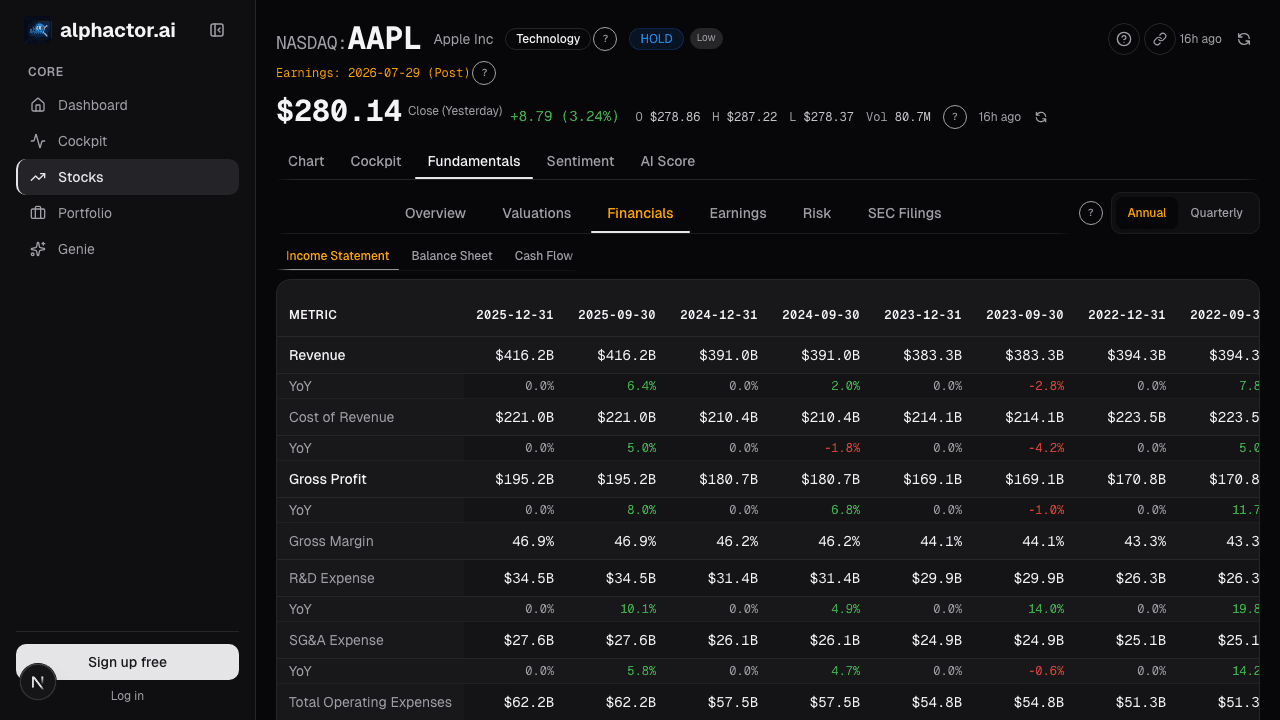
Open the Income Waterfall → /app/stocks/AAPL/fundamentals
See it in the app
Live dashboard views that match this post. Each tile deep-links to the exact card.

Stocks mentioned
Related reading
Accruals Quality: How to Spot Earnings That Aren't Real
Accruals measure the gap between reported earnings and actual cash. Widening accruals is one of the most reliable red flags in financial analysis, Sloan's…
Altman Z-Score: A Bankruptcy Predictor That Still Works
Edward Altman's 1968 discriminant model predicts bankruptcy within two years about 72% of the time at its distress threshold.
Balance Sheet Deep Dive
Balance sheet changes lead income statements by 2-6 quarters. Net debt, receivables days, and goodwill are the lines that move stocks first.
Gross Margins as a Moat Indicator: What 40%+ Really Means
Why gross margin is one of the strongest signals of competitive advantage, how to interpret it by sector, and what margin trends reveal about business quality.
Income Statement Deep Dive
Press releases report two numbers. The full P&L is where you find restructuring charges pushed below the line, segment reclassifications that change…
Ready to try alphactor.ai?
Validate your trading strategies with statistical credibility testing. Start free.
Get Started Free