Part of: Technical Analysis
MACD Beyond Crossovers
The MACD histogram reveals momentum shifts before the signal line cross. Here is how to read it properly and combine it with volume.
 Jake Morrison4 min read
Everyone Watches the Wrong Thing
Ask ten retail traders how they use MACD and nine will say the same thing: buy when the MACD line crosses above the signal line, sell when it crosses below. It is the most taught and least effective application of the indicator.
Signal line crossovers are lagging by design. The MACD line is the difference between two moving averages. The signal line is a moving average of that difference. By the time one crosses the other, you are reacting to days-old price action. On TSLA in January 2024, the bullish crossover fired at $218. The move started at $195. An 11% head start handed to faster traders.
The histogram is where the real information lives.
What the Histogram Is Telling You
The MACD histogram is simply the distance between the MACD line and its signal line. When the histogram is positive and growing, bullish momentum is accelerating. When it is positive but shrinking, bullish momentum is decelerating, even though MACD has not crossed over yet.
This is the critical insight most traders miss. The histogram turns before the crossover. Always. By definition, the histogram must shrink toward zero before any crossover can occur. That shrinkage is your early warning.
Think of it like a car speedometer. The crossover tells you the car changed direction. The histogram tells you the car is braking. You want to know about the braking, not wait until the car is already heading the other way.
Histogram Divergence: The Strongest MACD Signal
When price makes a new high but the MACD histogram makes a lower peak, momentum is weakening. This is histogram divergence, and it is materially more useful than a standard MACD crossover.
MSFT in July 2023 provides a clean example. Price pushed to $366, a new 52-week high. The MACD histogram peaked at 2.8. Two weeks later, price reached $370, but the histogram only reached 1.9. The divergence preceded a 10% pullback to $330 over the following six weeks.
The same logic works in reverse. AMZN in late October 2023 made a lower price low near $118 while the MACD histogram put in a shallower negative bar than the prior swing. That bullish divergence preceded a $30 rally.
Not every divergence leads to a reversal. In strong trends, you can see multiple divergences before the trend actually breaks. But divergences change the probability, and that is all any indicator can do.
Zero-Line Momentum
The histogram's relationship to the zero line tells you something about the trend's structural health.
When the histogram crosses above zero, the MACD line is above its signal line. That is the crossover everyone watches. But watch what happens next. If the histogram quickly reaches a high value and stays elevated, the trend has legs. If it crosses zero and immediately starts shrinking, the crossover was likely a head fake.
A practical filter: after a zero-line cross, wait for the histogram to print at least three consecutive bars in the same direction. On SPY during 2023, this simple filter eliminated roughly 40% of false crossover signals while keeping most of the profitable ones.
The zero line also works as a momentum regime indicator. Count the weeks the histogram spends above versus below zero. If it has been positive for 8 of the last 10 weeks, you are in a bullish momentum regime regardless of what any single bar shows.
Combining MACD Histogram with Volume
MACD on its own is a price-derived indicator. It cannot tell you anything about conviction behind the moves. That is where volume comes in.
The best histogram signals occur when volume confirms the momentum shift:
Strong bullish: Histogram rising from below zero to above zero on increasing volume. This was the setup on META in early January 2024 before it ran from $345 to $390. Volume expanded 35% above its 20-day average as the histogram went positive.
Weak bullish: Histogram crosses above zero but volume is declining. This happens frequently in low-conviction rallies and dead-cat bounces. JPM showed this pattern multiple times in Q3 2023, with each signal failing within days.
Bearish warning: Histogram positive but declining while volume spikes on down days. The up-move is losing momentum while sellers are becoming more aggressive. This is often the last warning before a meaningful pullback.
Practical Settings and Timeframes
The standard MACD settings of 12, 26, 9 work fine for swing trading on daily charts. Traders who test hundreds of parameter combinations usually end up curve-fitting to historical data.
One modification that does help: use MACD on weekly charts for trend direction and daily charts for entry timing. If the weekly histogram is positive and rising, only take bullish daily setups. This eliminates counter-trend trades that look good on a daily chart but are fighting larger momentum. You can backtest MACD-based strategies to see how different settings and timeframe combinations perform on specific stocks.
Alphactor charts combine MACD histogram readings with volume analysis and other momentum indicators. A MACD histogram divergence that shows up alongside declining OBV and narrowing Bollinger Bands is a materially different situation than a standalone divergence.

Stop Treating MACD as a Traffic Light
MACD is not green-light-go, red-light-stop. It is a momentum thermometer. The histogram tells you whether momentum is heating up or cooling down, often days before the crossover makes it obvious. Read the histogram. Watch for divergences. Confirm with volume. That is how the indicator was meant to be used.
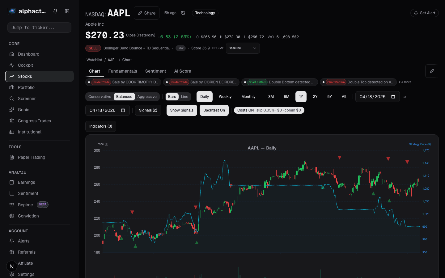
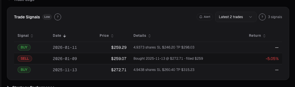
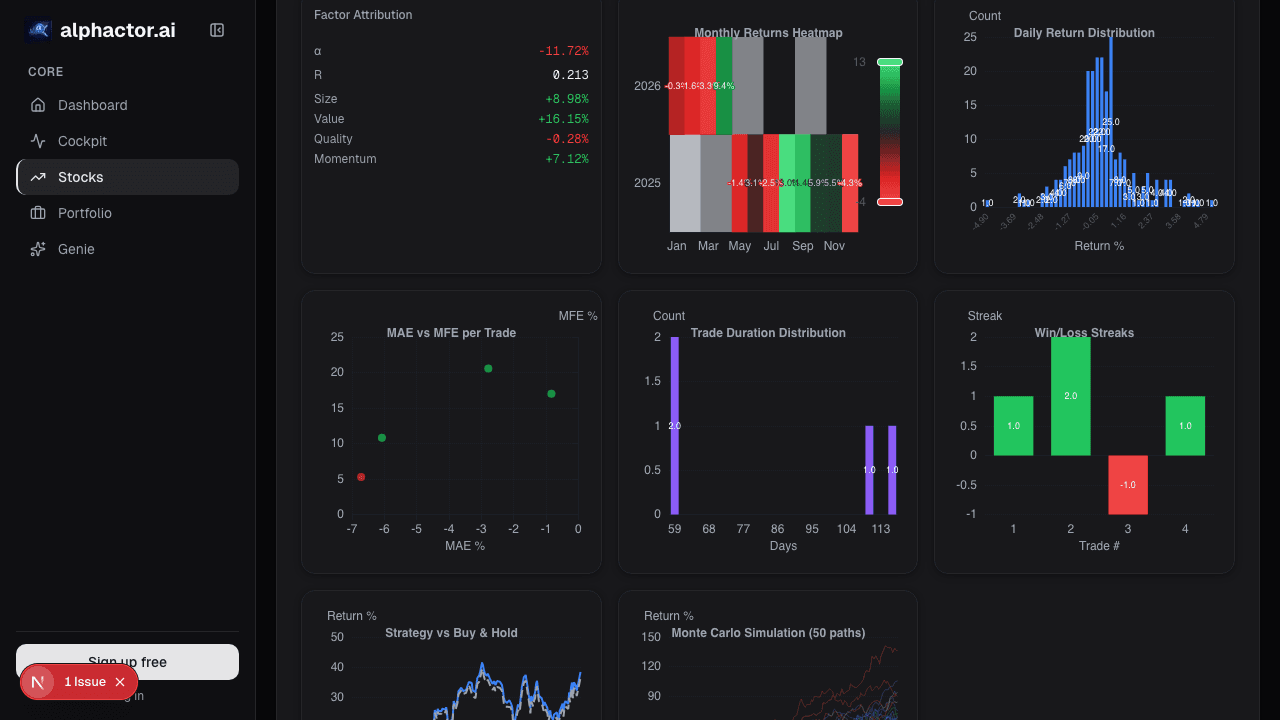
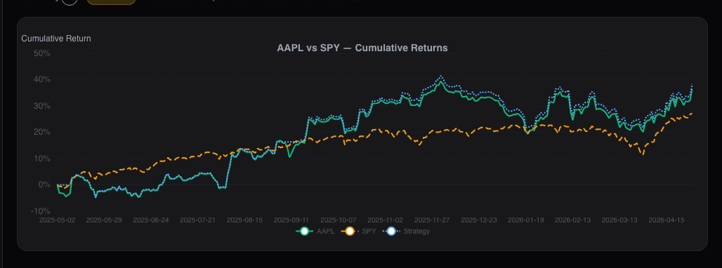
See it in the app
Live dashboard views that match this post. Each tile deep-links to the exact card.
Stocks mentioned
Related reading
5 Candlestick Patterns With Real Statistical Edge
Most candlestick patterns are noise. Research shows only a handful have measurable predictive power, and context matters more than the pattern itself.
Why Stacking 5 Indicators on Your Chart Is Making You Worse
Most traders use too many indicators that say the same thing. Learn how to pick 2-3 complementary indicators and reduce signal noise.
Fibonacci Retracements
An honest look at Fibonacci retracements in trading, why they seem to work, when they actually help, and the 61.8% level's mixed track record.
Ichimoku Cloud: Complicated, but Here's What Matters
A practical breakdown of Ichimoku Cloud trading: which of the five lines actually matter and when simpler indicators do the job just as well.
SMA vs EMA vs WMA: Which Moving Average Actually Matters
A practical comparison of simple, exponential, and weighted moving averages with backtested data showing when each type works and when it does not.
RSI: The Most Misused Indicator in Retail Trading
Why buying at RSI 30 and selling at 70 loses money, and what RSI actually tells you about momentum, divergences, and failure swings.
Ready to try alphactor.ai?
Validate your trading strategies with statistical credibility testing. Start free.
Get Started Free